Hello everyone,
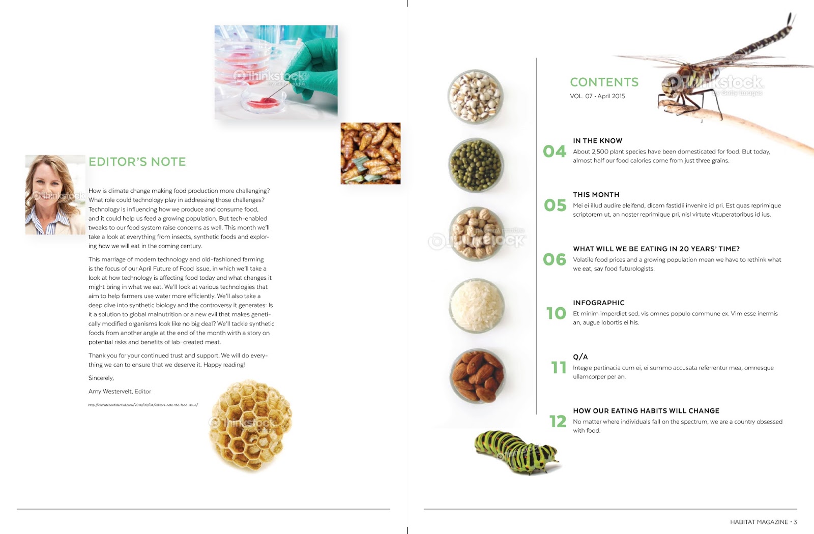
I hope everyone had a delicious and wonderful thanksgiving holiday! This week without class in session, I worked on my table of contents page, which occupies two pages. I proposed to do this because I felt that it an imperative elements as it's building a 'map' of your publication. Like the web, people need to know their way around the magazine without any 'critical' thought! My design involved several illustrations, but also several wonderful ideas that had to be scrapped prior to time, its relevance to the information or my audience and to provide real estate to 'calm the reader's vision'! This page helped me visualize images my audience is likely to consider! Remember, this is 'just' a draft, so some elements will likely receive major improvements!
Tell me what you think?
Friday, November 28, 2014
Table of Contents draft
Here is my initial draft for the TOC. I wanted to keep the clean consistency of the rest of the magazine with the cut out insects while introducing some full background images in rectangles. I'm wondering if the scale of the insects look strange along with the rest of the images?
Revised: Table Of Contents
I have made 2 new ideas for the Table of Contents. I don't know What direction to take. Working on finding the path I want to take. I know that I want to play with shape (and perhaps color). The more feedback the better.
Table of Content
For my table of Content I chose to use large images and a lot of white space. I used a running footer to balance the header but I'm not quite sure it works well.
Thursday, November 27, 2014
Table of content & first draft of magazine
Sins i finally had extra time this quarter to do some homework without rushing everything, I motivated myself to finish the magazine just to see how the first draft will look like. What i like is the negative space and how easy the information flows from page to page. I am hesitant to add another element just to make every page look different "What you guys think?"
Wednesday, November 26, 2014
Table of Contents - Tobias
I went a bit out of my personal norm and attempted a new technique with the table of contents. I found the background image, printed it out, and then proceeded to rip and curl a section of the paper back. I then took a photograph of the (ripped) photograph and proceeded to adjust colors, levels, etc. in photoshop. Lastly I imported it into indesign where the text was added.
I went a bit out of my personal norm and attempted a new technique with the table of contents. I found the background image, printed it out, and then proceeded to rip and curl a section of the paper back. I then took a photograph of the (ripped) photograph and proceeded to adjust colors, levels, etc. in photoshop. Lastly I imported it into indesign where the text was added.
Tuesday, November 25, 2014
Monday, November 24, 2014
Sunday, November 23, 2014
Subscribe to:
Comments (Atom)


