Saturday, November 1, 2014

exercise 3_Jose Gonzalez


This week we exercise assignment was to create magazine covers.

My first the design I wanted to experiment with placement of the text and half cut out of and image. I use this image because i wanted to follow the content"The future of Farming".I also took a beautiful background color from the image which i think make the text and image pop more.

My second design i wanted to create something modern but also symbolize  my target audience.I use this beautiful image of vegetables and with a good  placement of the logo and content i think i have achieved that.I also use wanted to experiment with the  text so i found this unique brush stroke text and wrote "The things man eat" to draw in the target audience.

My final design i use two very unique images to make an illusion to drawing the target audience. I place the logo in clearspace so people can read it and i also did the content in clear space. All i wanted to do with this design is to experiment with the images to see if it could reach the target audience by using just the image and clearspace.


Friday, October 31, 2014

Spreadpage_Rich


My goal here was still to communicate to a middle-aged home owner audience, with compelling images that relate to the issue, and colors chosen to provoke despair. I used line and negative space to trap the body copy.

Michael's Exercise 2


Keeping with my previous posts, with using basic color to create my
overall design, I feel these three designs provide a rhythm to the 
overall look and feel.

Thursday, October 30, 2014

Blodgett Exersize #2

Two-Column Even

Two-Column Un-even

Two Column with Custom Margins

Exercise 2: Feature

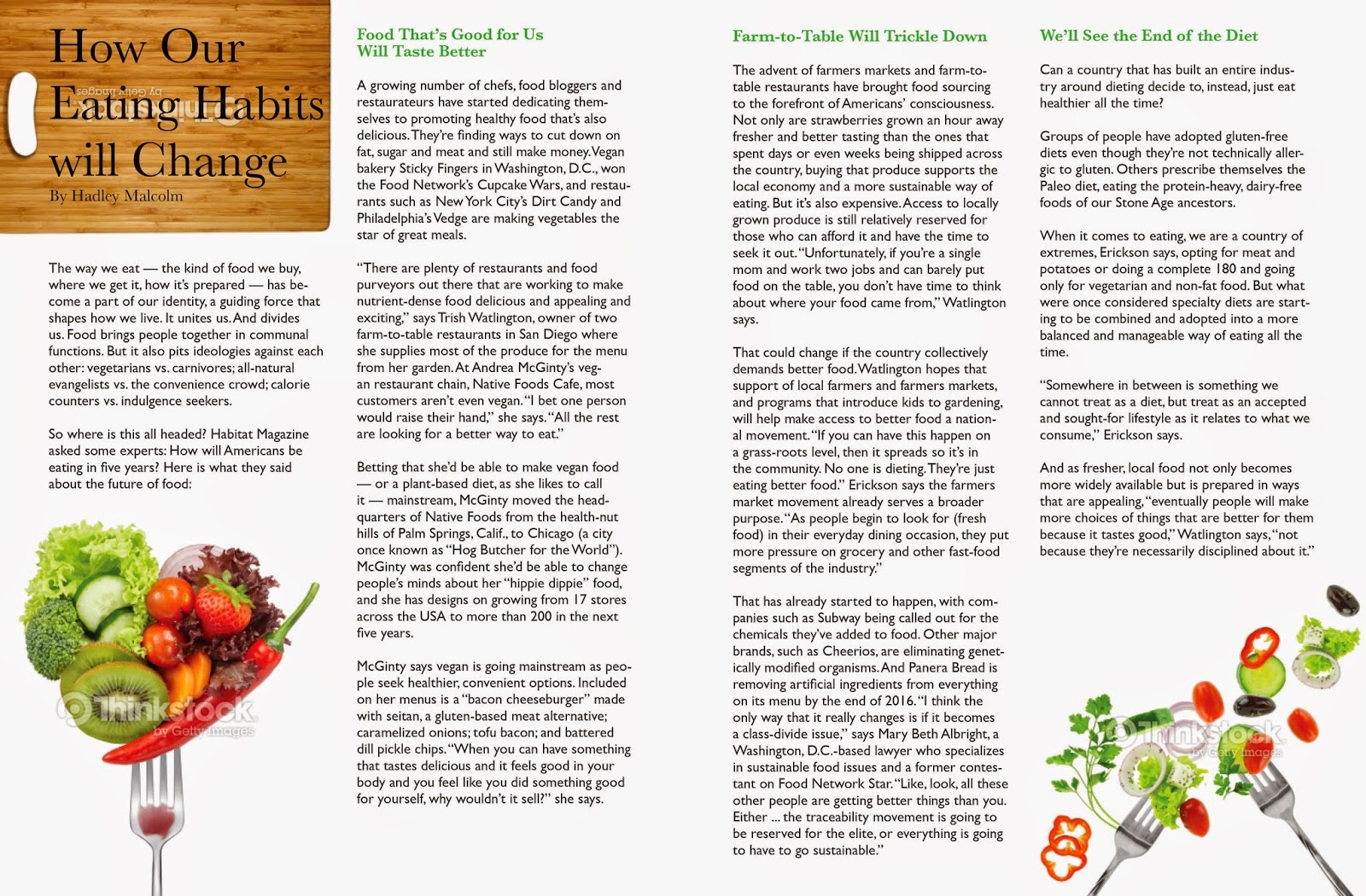
I wanted to use this exercise to play around with the idea of how spreads work without being extremely connected like work I have from the past where it has images in the middle or going from page to page so that you visually know that yes this is a spread. Just opening the ones I have created I wanted it to have a strong cohesion within the design without having to pull gimmicks. 

a

b

c

Features


For each of the different grids I choose to take a different approach. The second and third ones being my favorites because I like working uneven columns or number of columns.

Exercise 2


I choose The Next Green Revolution as my magazine, I focused in getting a structural grids to show a very informative design. I also added different color palattes to show contrast.  


The following are examples of 2 column grid, an uneven 2 column grid, and a grid of my choosing. for this exercise I used a lot of transparency. Placed images behind transparent background color to get a clouded effect. as well as organized paragraph set up.

Features - Tobias


The article that I choose for my first feature was "The Next Green Revolution". As my magazine is focusing on the facts and science behind food, I felt GMO was a prime topic to bring up. As with my department page, this articles are meant to inform and educate.


A - 2 Column
B - 2 Column Uneven
C - 3 Column


Redo of Page for Exercise 1

Hey everyone, I just wanted to hear some input on my redesign on one of my layouts from last week! Since I have a taste for originality, I decided to create an illustration that's dedicated to The Future of Foods as well as a set of icons for Underused and Overlooked

Here's the before and after:


BEFORE:


AFTER:


Hi guys, here are my three spreads... option C I decided to go with a 7 column grid with .25 gutters. I wanted to give myself a lot of freedom to play around with text/image placement. After much feedback I decided to go with my second version with the circles blue/orange theme because it is a little out of comfort zone and I wanted to challenge myself. I plan to target forward thinking young/middle aged audience who are interested in learning more about the food industry and the future the industry.

In the first even column grid I feel a little stuck on the upper half of the right page... it seems a bit empty but anything I put there, in my opinion, compete the with the title and image behind it so any feedback on that would be greatly appreciated. I like where its going so I didn't want to just go back to the drawing board before posting.

They are all a work in progress but I am trying to push myself on this one!

Thanks guys


Wednesday, October 29, 2014

Matt's Exercise 2

This was worthwhile I thought; I really enjoyed experimenting with these layouts!

The following layouts I designed this week:

a. ) two, even columns
b. ) two, uneven columns
c. ) BYO (my choice and somewhat abstract)


Who's my targeted audience for this magazine?

My audience for this magazine concentrates towards undergraduate college students and young entrepreneurs, aged between 21-36! My primary initiative for the magazine is to educate young adults regarding our environment and to help them structure innovative solutions, whether if it's through writing or art, to make the world a happier and healthier atmosphere!


What's my primary goal regarding these designs?

The goal of this exercise was to explore 'unique' and clear ways of conveying information through a featured article I'm likely to apply to my final project! Like the previous exercise last week, exploring distinctive methods of structuring the information is key, but also to construct an 'aesthetic' foundation for the Final design!


Which of the spreads did I specifically enjoy working with most?

Well, for someone humble about his efforts, I must admit that illustrating for the first spread was an enjoyable experience as it required me to really think outside the box! The illustration I designed depicts an apple (a healthy perishable), mirroring a human that's struggling to seek food! This is a serious matter, so I really wanted the 'darkness' of the illustration to build concern among readers, especially to those who think that 'several of them did it to themselves for some costly mistake'! Readers must know that life is rough, but at the same time, to make a difference for the victims of hunger - to do good karma in other words! 

For the rest of the layouts, I enjoyed working through all of them. Each provided several, creative challenges, such as placing an image that composes asymmetry throughout the second layout! Despite the amount of time consumed on each layout and my areas of development, including hyphenating, I personally think that I'm growing confidence on what I'm working with for the Publication Design course!

  
**Keep in mind that I'll be eventually posting a draft of one of my layouts from Exercise 1!


Tuesday, October 28, 2014

Feature Page Layouts—ex.2

My 3 layouts for this week:
A) 2 even columns
B) 2 uneven columns
C) 3 even columns (my choice)

Target audience for the magazine: Well educated adults aged 25–45 interested in learning about the world, actively engaged in making a difference in their lives, and curious.

I wanted my designs to feel clean and structured while still being interesting. 
Last week, I was warned against using "justified left" on my paragraphs too often, so I tried out these new designs without it. Also, I played around with a duotone image, pull quote and drop cap.

I really enjoyed working with the 2 uneven columns because it isn't something I normally use and I felt a little out of my comfort zone, but feel I have appropriately filled the space and as a result, think it is one of my strongest spreads.