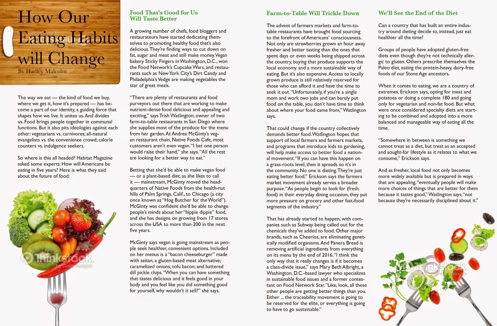
I wanted to use this exercise to play around with the idea of how spreads work without being extremely connected like work I have from the past where it has images in the middle or going from page to page so that you visually know that yes this is a spread. Just opening the ones I have created I wanted it to have a strong cohesion within the design without having to pull gimmicks.


Ruby, I think that many of the design decisions you made here were based on a belief that you needed to use all of the type on these 2 pages. Not so! Use only 1/2 (or less) of the text I see here, and assume that it will continue onto another page or spread. The features can be up to 5 pages long if you like. So - return to these spreads, rethink them with this new freedom, and I suspect your solutions will be quite different. Use negative space, large photos and heading, and create the elements you need to allow your design to "show us" the content... not just allow us to read all the words.
ReplyDelete