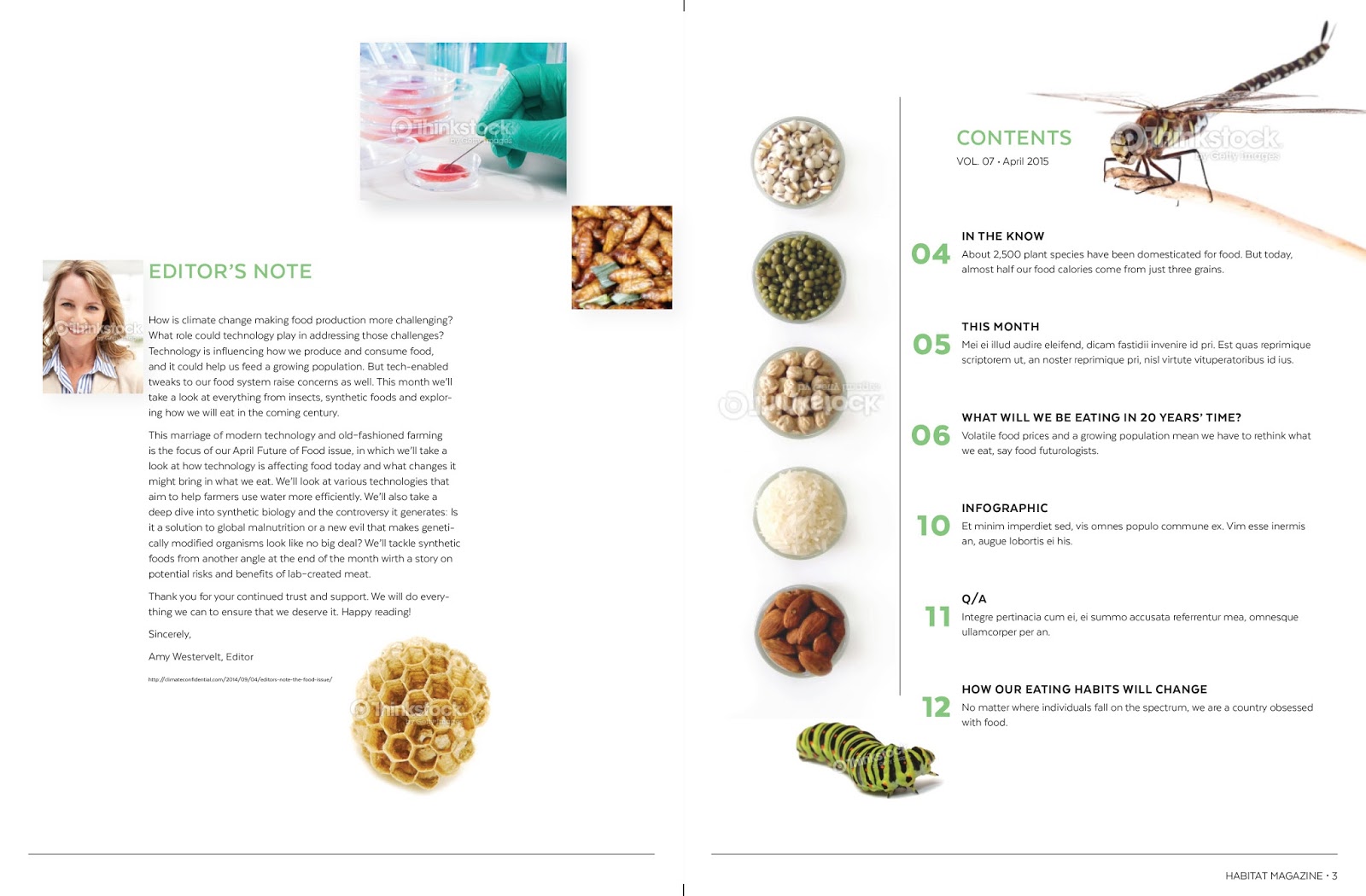
Here is my initial draft for the TOC. I wanted to keep the clean consistency of the rest of the magazine with the cut out insects while introducing some full background images in rectangles. I'm wondering if the scale of the insects look strange along with the rest of the images?

Tania - I think the silhouettes work really well here, and I love the size of the insects. This is provocative, which is what the T of C is for.
ReplyDeleteThe rectangular images need to sit more clearly on the grid structure... right now they seem randomly placed, and approach the gutter and fold area too closely. Also, I wonder if the Editor's photo is crashing the paragraph of type?
Eventually, you'll need a title for your infograph - but you know this.
Nice work, this is almost done.
I really like how this is coming along... I recall Coni saying it gave her a bit of a science textbook feel and I totally see that... in a good way of course! I think you've managed to lay out a lot if information and have it not feel cramped.
ReplyDeleteI wonder if those two additional square photos on the left page are even necessary, maybe removing them will give your editor's note some more room to separate the note from the photo to the left. I do see what Coni means by it looking a little close!
I think the caterpillar loos amazing by the way :) such a great photo to use.